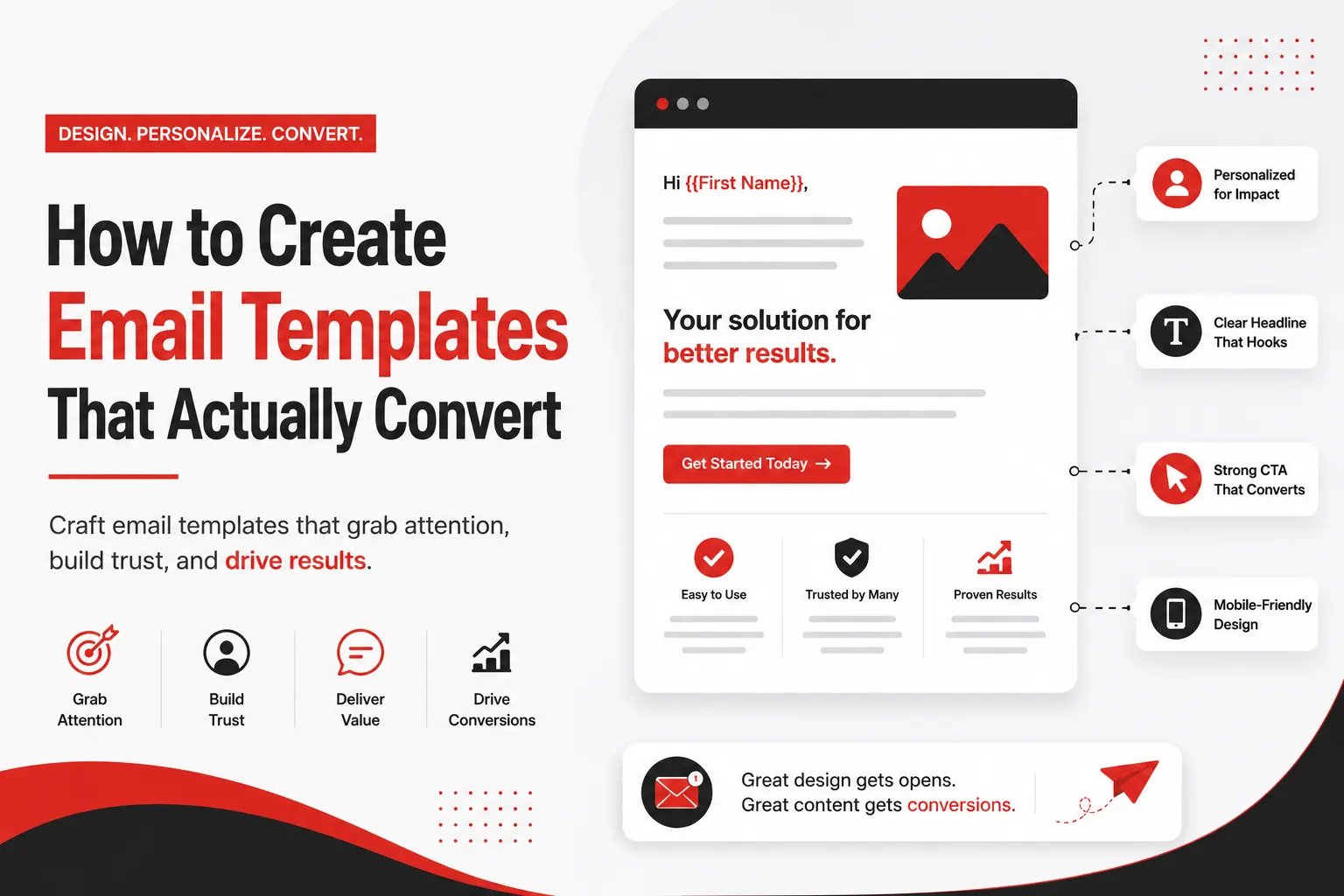
How to Create Email Templates
That Actually Convert
The complete guide for website designing companies — CTAs, headings, images, and content strategy that turns subscribers into clients.
For a website designing company in Pakistan, email is your single most powerful sales and retention channel. A well-crafted email template can showcase your portfolio, communicate your expertise, generate project enquiries, and nurture leads — all on autopilot. Yet most web design agencies in Karachi and Lahore send email that looks like it was written in a rush, with no structure, no clear call to action, and no strategic purpose.
This guide will walk you through every element of a high-converting email template — from the subject line to the footer — with specific examples for a website designing and digital marketing company like yours.
1. Email Template Anatomy — Every Element Explained
Before building an email template, you need to understand what every element does and why it is there. A high-converting email is not just good-looking — every part has a specific job to do.

Figure 1: Full email template anatomy — every section labelled with its purpose and best practices
| Element | Purpose | Best Practice for Web Design Company |
|---|---|---|
| Subject Line | Gets the email opened | Include a benefit + number: "5 Web Design Mistakes Killing Your Sales" |
| Preheader | Supports the subject line | Expand on the promise: "Most Karachi businesses make #3 without realising it" |
| Header / Logo | Brand recognition | Boundless logo on red background, max height 80px |
| Hero Image | Visual hook, stops scrolling | Website screenshot or before/after design comparison |
| H1 Heading | Communicates main message | Should match or extend the subject line promise |
| Body Copy | Delivers value, builds desire | 3 short paragraphs max. Lead with value, not your company |
| CTA Button | Drives the desired action | Red button, action verb, single link only |
| Footer | Legal compliance + trust | Logo, address, unsubscribe link, social icons |

Figure 2: Email content structure pyramid — what matters most at the top, support elements below
2. Subject Lines That Get Opened
Your subject line is the single most important element of any email. Without a compelling subject line, the rest of your perfectly designed template will never be seen. For a website designing company marketing to Pakistani businesses, your subject line must be specific, benefit-driven, and create curiosity or urgency.
Subject Line Formulas That Work
The Number Formula
"5 Website Mistakes Costing Karachi Businesses Clients Every Day" — Numbers in subject lines increase open rate by 15–20%. Odd numbers (3, 5, 7) outperform even numbers.
The Question Formula
"Is your website sending clients to your competitor?" — Questions create a knowledge gap the reader wants to close. Especially effective for B2B web design services.
The Direct Offer Formula
"Free Website Audit for Karachi Businesses — This Week Only" — Direct, specific, time-limited. Best for promotional emails with a clear offer.
The Social Proof Formula
"How we helped a Karachi restaurant get 3x more online orders" — Case study subject lines perform exceptionally well for web design companies because they demonstrate tangible results.
For mass-market B2C email campaigns in Pakistan, Roman Urdu subject lines consistently outperform English-only. Example: "Aapki website clients kyun kho rahi hai?" (Why is your website losing clients?) Tests show 22–31% higher open rates for retail and restaurant sectors with bilingual subject lines.
3. Headings — Structure Your Email for Skim Readers
Studies show that 73% of email readers skim before they decide to read. Your headings are what they skim. If your headings do not communicate the value of your email instantly, most readers will delete before reaching your CTA.
H1 — The Main Email Headline
Your H1 heading appears immediately below your hero image. It should reinforce or expand on the subject line promise. For a web design company, this is typically the central benefit or insight you are delivering in this email.
[Specific outcome] for [specific audience] in [specific timeframe]
Example: "A 5-Page Business Website That Generates Leads — Ready in 7 Working Days"
Example: "How Pakistani SMEs Are Getting More Clients with Smarter Websites in 2026"
H2 — Section Subheadings Within the Email
For longer emails (newsletters, digest emails), H2 subheadings break content into scannable sections. Each H2 should communicate a complete, standalone idea so a skimmer gets the full picture just from the headings alone.
- Keep H2 under 8 words for mobile readability
- Use brand red (#E61E1E) for H2 colour to maintain visual brand consistency
- Add 20px margin above each H2 to create visual breathing room
- Never use more than 3 H2 sections in a single promotional email
H1: 28–32px, Sora Bold, #323232 | H2: 22–24px, Sora SemiBold, #E61E1E | Body: 15–16px, Inter Regular, #5A5A5A | CTA Button: 15–16px, Inter Bold, #FFFFFF on red background
4. Images — When, Where & How to Use Them
Images in email are one of the most misunderstood elements. Used correctly, they increase engagement and time spent reading. Used incorrectly, they slow load times, trigger spam filters, and distract from your CTA. For a website designing company, images are especially powerful because your work is inherently visual.
Best Image Types for a Web Design Company Email
Website Screenshots — Before & After
The single most effective image type for a web design company. Show a client's old website on the left and your redesign on the right. This communicates your value instantly without a single word of body copy.
Results & Metrics Screenshots
Google Analytics showing traffic increase, Google Search Console showing keyword rankings, or a client's sales dashboard showing revenue growth after you redesigned their site. Real numbers build instant credibility.
Team & Process Photos
For nurture emails, photos of your Karachi team at work, your design process, or your office create personal connection and differentiate you from faceless agencies. Real people build trust.
Infographics & Data Visuals
For educational newsletter emails — charts, comparison tables as images, or step-by-step process diagrams. These get shared and saved, extending the reach of your email beyond the inbox.
Image Technical Requirements
| Specification | Required Value | Why It Matters |
|---|---|---|
| Max width | 600px | Standard email client width — wider images break layout |
| File size | Under 150KB per image | Emails over 500KB total go to spam in Gmail |
| Format | JPG for photos, PNG for logos | WebP not yet supported in all email clients |
| Alt text | Required on every image | 40% of email clients block images by default |
| Total images | Max 3–4 per email | More images = higher spam score + slower load |
| Image-to-text ratio | 60% text, 40% image | Pure image emails are blocked by spam filters |
40% of Pakistani email clients have images blocked by default — especially corporate Outlook users. Every image must have descriptive alt text styled in your brand color so the email remains readable even when images are disabled. Example: alt="Boundless Technologies website redesign — before and after for Karachi restaurant client"
5. Content — What to Write and How to Write It
The biggest content mistake web design companies make in email is writing about themselves. "We are a leading web design agency in Karachi with 20 years of experience" is about you. Your subscriber does not care about you — they care about what you can do for their business. Great email content leads with the subscriber's problem and positions your service as the solution.
The 3-Paragraph Email Body Formula
Paragraph 1 — Identify the Problem (2–3 sentences)
State the exact problem your subscriber is experiencing. Be specific. "Most Karachi businesses spend PKR 50,000–150,000 on a website and then watch it sit on page 3 of Google with zero enquiries coming in."
Paragraph 2 — Present the Insight (2–3 sentences)
Share a specific insight, tip, or finding that reframes the problem. "The issue is almost never the design — it's that the website is built for the client's preferences, not for the visitor's journey. Our audits show that 80% of Pakistani business websites have no clear conversion path."
Paragraph 3 — Bridge to Your CTA (1–2 sentences)
Connect the insight directly to your offer. "We run a free 20-minute website audit that identifies exactly where your site is losing visitors — and what to fix first. Claim your free audit below."
Content Rules for Web Design Company Emails
- Write at 8th-grade reading level — use the Hemingway App to check. Simple language converts better than impressive vocabulary.
- Use "you" 3x more than "we" — every sentence should be about the subscriber, not your agency.
- One idea per email — emails that try to cover too much end up communicating nothing clearly.
- Short paragraphs — maximum 3 lines per paragraph for mobile readability. White space is not wasted space.
- Add Pakistan context — mention Karachi, Lahore, local businesses, PKR pricing wherever relevant. Local specificity builds trust.
Use merge tags to personalise beyond just the first name: {{company_name}}, {{industry}}, {{city}}. An email that opens with "Hi Ahmed, we noticed [Company Name] doesn't have an SSL certificate..." converts 6x better than a generic email blast.
6. CTAs — The Most Important Element of Any Email
Your Call to Action (CTA) is the entire point of your email. Everything else — the subject line, the heading, the body copy, the images — exists to get the reader to click one button. Yet most web design company emails bury their CTA at the bottom, use weak language like "Click here", or include 4–5 different CTAs that confuse the reader into inaction.

Figure 3: The 5 dimensions of a high-converting CTA button — colour, size, text, placement, and spacing
CTA Button Design Standards — Boundless Brand
| Property | Value | Reason |
|---|---|---|
| Background color | #E61E1E (Boundless Red) | Brand consistency + high contrast = more clicks |
| Text color | #FFFFFF (White) | Maximum contrast ratio for readability |
| Font | Inter Bold, 15–16px | Matches brand font; bold improves readability |
| Padding | 14px top/bottom, 32px left/right | Creates generous tap target for mobile |
| Border radius | 8px | Modern, approachable — not too sharp, not too round |
| Min width | 200px (desktop), 100% (mobile) | Full-width CTA on mobile improves mobile CTR by 35% |
| Hover state | #B81515 (darker red) | Visual feedback confirms the button is clickable |
CTA Text — Use Action Verbs That Create Desire
Every promotional email should have exactly one primary CTA. You can repeat the same CTA button twice — once above the fold and once at the end of the email — but both buttons must link to the same destination. Multiple different CTAs in one email reduce total clicks by up to 42% because they split attention and create decision paralysis.
7. Live Email Template Example
Here is a complete, ready-to-use email template for a website designing company promoting a free website audit. Every element follows the principles covered in this guide.

Is Your Website Costing You Clients?
Hi [First Name],
We recently audited 50 websites belonging to Karachi businesses in your industry. 82% of them had at least one critical issue silently turning away potential clients — and most owners had no idea.
The three most common problems we found:
❌ No clear call to action on the homepage (visitors don't know what to do next)
❌ Page load time over 4 seconds on mobile (73% of visitors leave after 3 seconds)
❌ Contact form buried on a separate page with no link from the homepage
Any of these sound familiar? We will tell you exactly which issues your website has — completely free — in a 15-minute audit call with our team.
Claim My Free Website Audit →This audit is free, takes 15 minutes, and comes with no obligation. We will send you a written report within 24 hours. Only 3 audit spots available this week.
Subject line: Specific problem + curiosity gap. Preheader: Extends the subject with more intrigue. H1: Reinforces the subject. Body: Problem first → specific data → bridge to offer. CTA: First person "My" + specific benefit + arrow. Scarcity: "Only 3 spots" creates urgency. Footer: Trust signals + easy unsubscribe.
8. Key Metrics to Track After Every Send
Sending an email without tracking results is like designing a website without checking Google Analytics. Every email campaign you send should be measured against these five metrics, and the results should inform your next campaign.

Figure 4: Email marketing benchmark metrics for Pakistan 2026 — know your targets before you send
| Metric | Formula | Target (Web Design) | If Below Target |
|---|---|---|---|
| Open Rate | Opens ÷ Delivered | 25–35% | Test subject lines; clean your list; improve sender reputation |
| Click Rate (CTR) | Clicks ÷ Delivered | 3–5% | Improve CTA text; add urgency; simplify email to one message |
| Click-to-Open (CTOR) | Clicks ÷ Opens | 15–25% | Body copy not matching subject line promise; CTA not compelling |
| Conversion Rate | Conversions ÷ Clicks | 2–4% | Landing page mismatch; form too long; missing trust signals |
| Unsubscribe Rate | Unsubs ÷ Delivered | Under 0.5% | Sending too frequently; content not relevant; wrong audience |
Ready to Send Emails That Actually Win Clients?
Boundless Technologies has been designing and running email campaigns for Pakistani businesses since 2002. We handle everything — template design, copywriting, automation setup, and monthly reporting.
Get a Free Email Marketing Audit → No commitment. 15 minutes. Written report within 24 hours.